


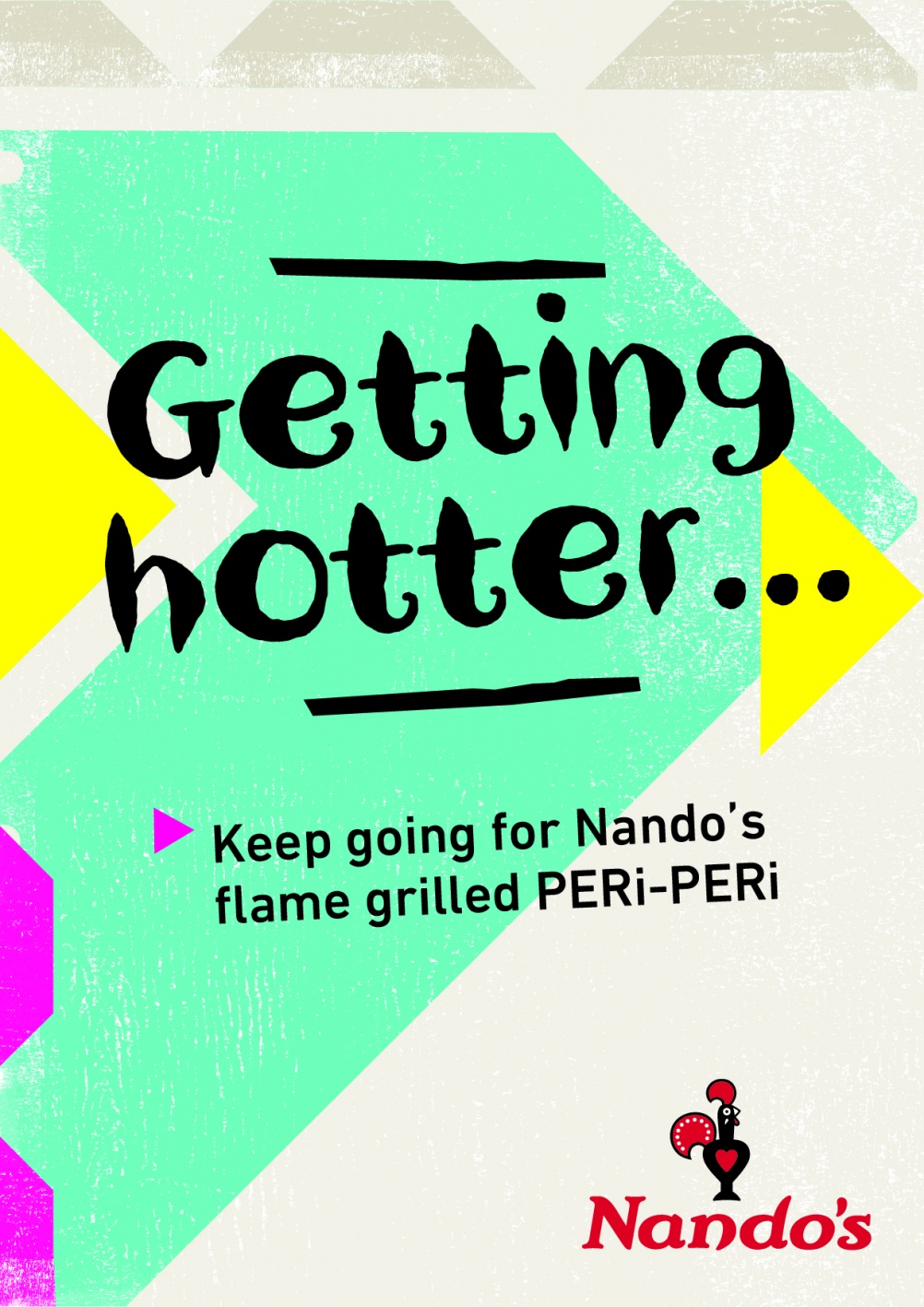
The all new Nando's Rebrand: PERi Red Pantone, 'Nando's Hand' Font and bright neon colour.
¡Aycarumba! The popular peri chicken chain has an all-new look – it’s drastically different to the ‘sticks and pots’ themed brand image that Nando’s previously sported – and instead aims to reconnect the brand with it’s South African roots.
Nando’s has the South African consultancy Sunshinegun to thank for the vibrant rebrand, who worked with a wide range of South African artists and craftsmen on the project, including sign maker Marks Salimu who has created the ‘Nando’s Hand Font’.
The bold font was hand painted onto wooden blocks which were then transformed into a digital format. Alongside the hand font is the typeface DIN Next – a font which can be found on all Johannesburg road signs where the first ever Nando’s opened it’s doors.
We’re so impressed by the attention paid to sentimental meaning and purpose behind each design element – the headlines are even offset at an 87 degree angle – representing the year 1987 when the company was founded. The abstract patterns feature lots of triangles, a common feature of South African art, and the trademark bird’s eye chilli. The colour red is still featured in the logo, called ‘PERi Red Pantone’, which was colour matched to the bird’s eye chilli, juxtoposed against energetic neons.
It’s not just the vibrant colour swatches and culture inspired designs that draw us at Bahiti towards this heart warming brand, our very own Co-Founder was once a Nandoca herself and still has a chilli shaped place in her heart for the tasty chicken shop.
Bravo Sunshinegun, we love the all new Nando’s look!